Designing My Dream Website (Part 6): Reaching the Start Line
Last updated: 15 minutes ago
Since the last update, I have spent the days hacking at my website. I am pleased to know... the thing is up on the Internet.
Looking back, it all happened so fast. But then those are FOUR days I'll never get back.
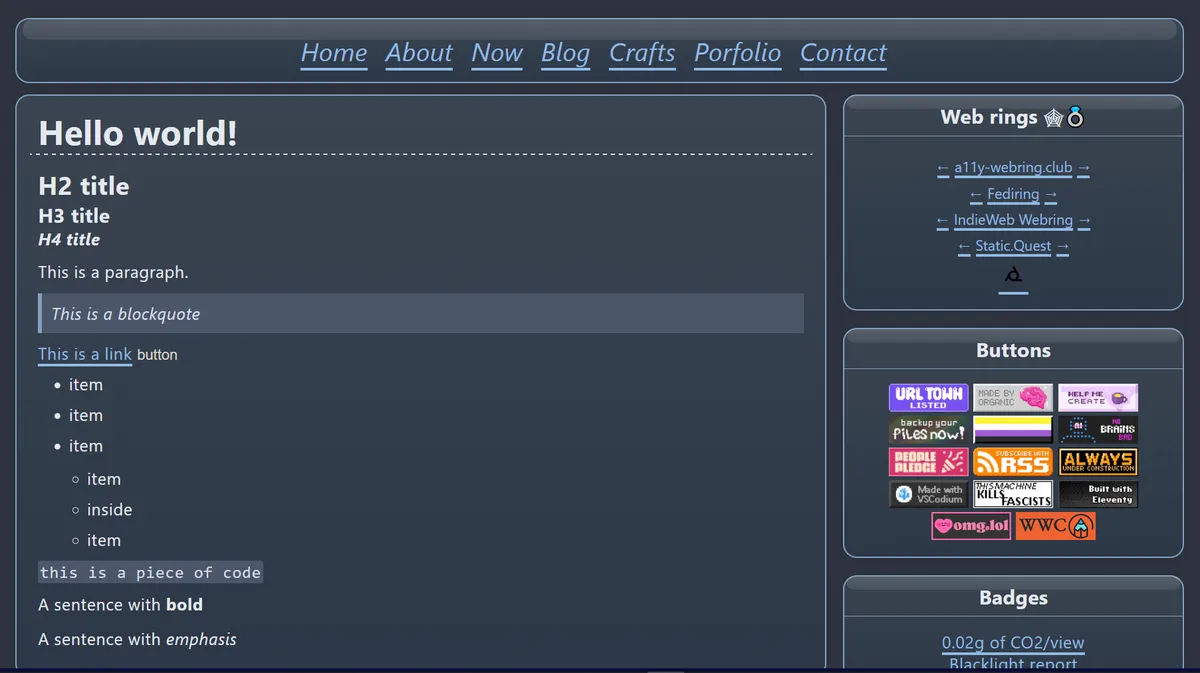
For comparison, this is the before and the after and then get to the details.
Before
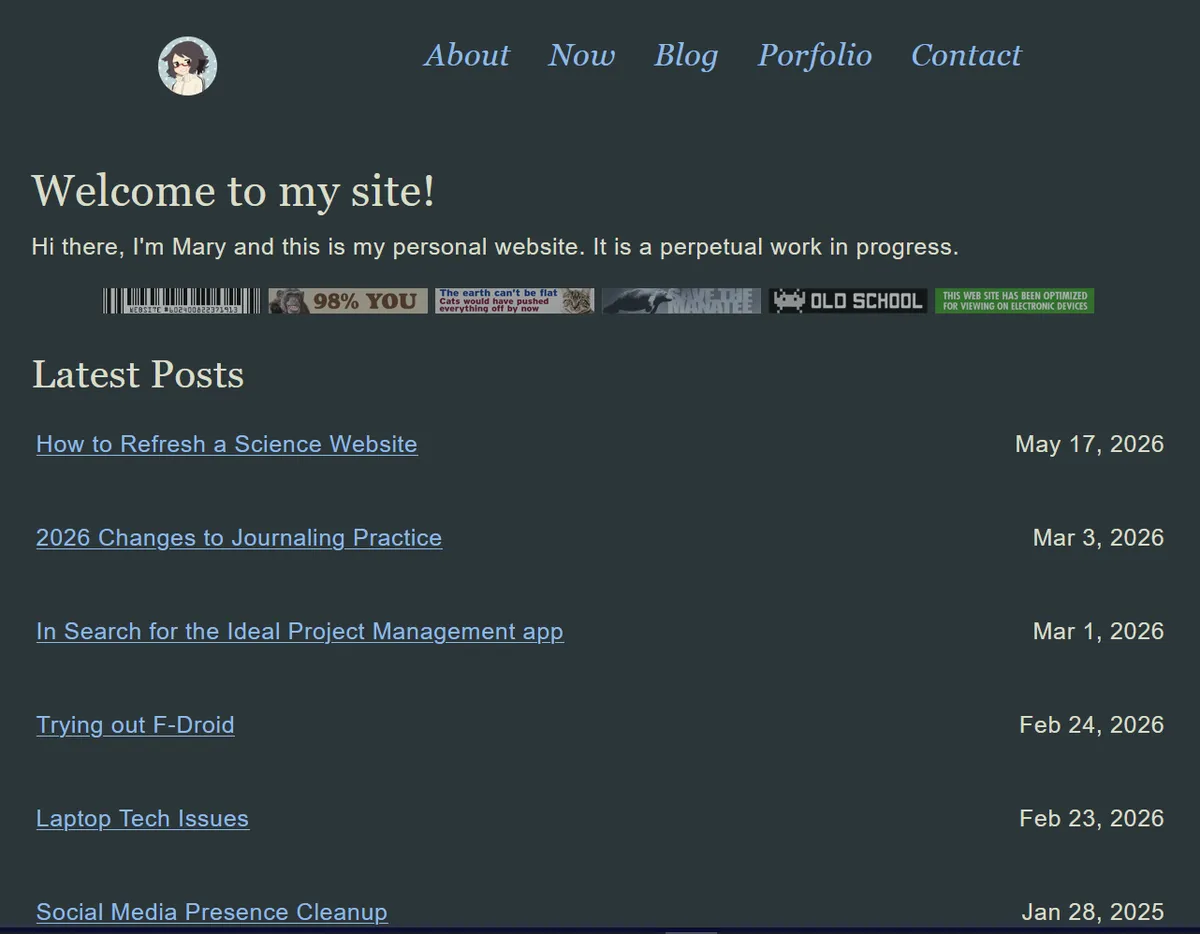
After
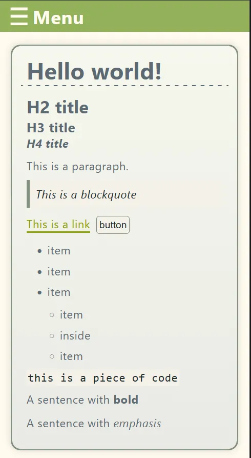
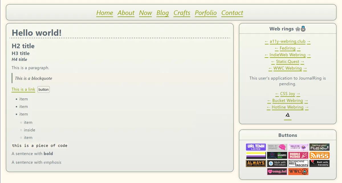
Light Mode
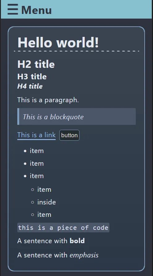
Dark mode
Process
After last post, I began putting the building blocks together. Then, as I was forced away from my PC, I took a some paper and began working on some sketches. I took my phone as well so I could check some references.
The main feature of this version is the two-column layout where the containers have rounded corners, a slight shadow, a border between the title and content and lastly a free-flowing footer. The main inspiration was The Frutiger Aero Community website mentioned in the previous post.
After coding the main layout, it still looked too flat for my liking. This is when I added the shadow and gradient to each container. Then, after more testing using gradients, I added a little bubble at the top of each container; it's more visible on dark mode for now. As I had only sketched the homepage, I later chose to have the two-column layout as the default on each page.
Then, last but not least, I played a lot with the color schemes. Just yesterday, I finished nailing down Everforest for light mode and Nord for dark mode. I wasted a lot of time setting up Nord when I just decided to copy the CSS variables and use them directly. In contrast, the Everforest color scheme is the same I am using for a site on Bearblog so I just copied that to this new site. I had to do some changes to make it work.
The reason why I got so hyperfixated on this site is because I have other stuff to do, so I challenged myself. I had to remind myself that this is only the beginning, that the real work is growing it and maintaining it.
The site isn't done, I have a long list of things I still want to do such as:
- add icons to main nav
- style "back to top" button
- add non-flat background (Frutiger Aero) style
- Pages to update
- Landing page
- About
- Colophon
- Accessibility
- add more padding to main container but not heading (how???)
- fix grammar on slash pages
- missing pages
- /blogroll
- /accounts
- tag blog posts with topics
- add working rss feed
- update hamburger menu with new code
- change cursor
- improve blockquote color scheme on light mode
And that's not even mentioning new pages I want to add.
For this build, I had a main goal, get something up that looked decent. Not good, decent. I drew a line to not update any of the pages. Well, except the changelog. After the first build, I did several fixes, mostly to the sidebar.
While this may be the last post of this series, this site will never be done.